
The Power of Subtle Color
Quiet color, lasting impact.
Many of our clients come to us with a clear appreciation for neutral tones—and understandably so. Neutrals are foundational. They bring breath, balance, and timelessness to a space. They act as a canvas, allowing architectural details and textures to take center stage without competition. In our work, they’re not just common—they’re essential to the layered, collected aesthetic we hold dear.
But here’s what we know from experience: neutrals reveal their full potential when they’re placed in conversation with color.
Even the most serene spaces benefit from contrast and depth. A thoughtful infusion of hue—however restrained—can direct the eye, highlight the architecture, shift the mood, and bring emotional warmth. The key is intention, not intensity.
Below are a few of our favorite ways to incorporate color with subtlety, elegance, and enduring effect.
1. Let Accessories Lead
Color doesn’t need to arrive loudly. In fact, some of the most memorable applications appear in quiet, deliberate gestures—a rust-toned throw. A moody ceramic tucked into a bookshelf. A burst of saturated pink through an unexpected piece of art.
These accents do not demand attention, but they draw it. They introduce complexity without disrupting calm.
Take this example from Lucas Interior: a mostly monochromatic room—textural whites, soft greys, rich woods—transformed by the bold choice of two pink-toned art pieces. The contrast doesn’t overwhelm; it enlivens. The space, once subdued, gains intrigue, playfulness, and a sense of daring. All through color used in conversation, not competition.
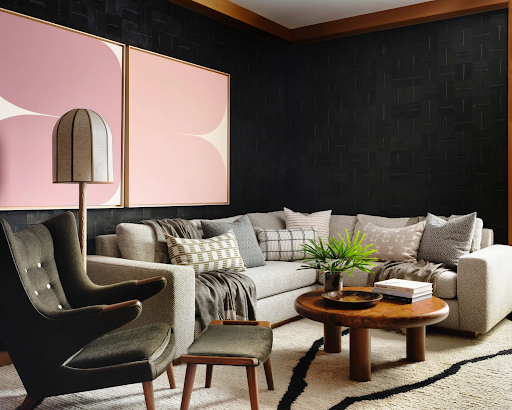
Interior Design: Lucas Interior; Photography: Douglas Friedman; Source: Architectural Digest, July 2025; Art: Sara Genn / Morgan Lehman Gallery
2. Begin with Green
If color feels intimidating, green is often the best place to begin. Not because it’s on-trend (though it is), but because it’s timeless. Green is hardwired into us—it’s the color of life, of nature, of calm.
From muted olive to deep forest, green settles into neutral environments almost imperceptibly. It doesn’t disrupt, it complements.
In Irene Forte’s London townhouse, designer Alice Gyllenkrok uses green in two key ways: a simple potted plant that softens the visual edges of a minimalist palette, and a velvet armchair in a bold silhouette that might feel risky in another color, but in green, feels grounded and essential.
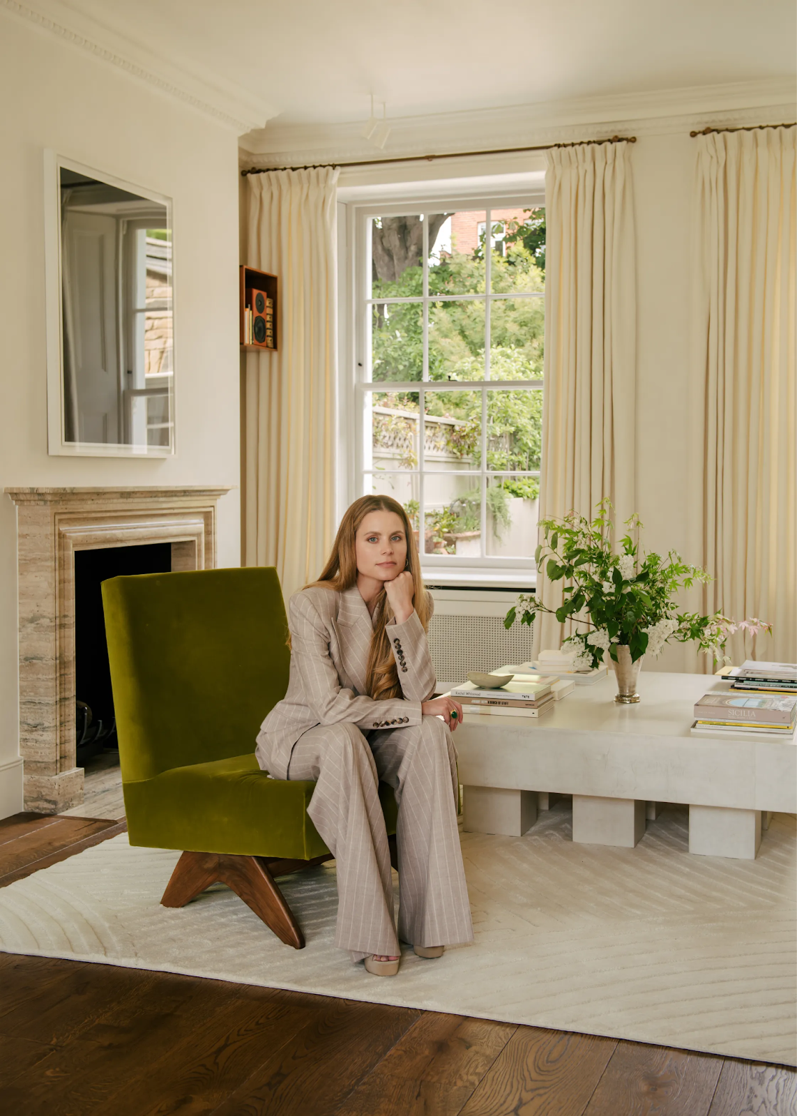
Interior Design: Alice Gyllenkrok; Photography: Genevieve Lutkin; Source: Vogue Living, May 2025
3. Follow Nature’s Lead
Once green feels at home, look around—literally. Nature provides the most reliable palette there is. Weathered wood, sky blue, clay terracotta, wildflower yellow, the blush of lavender—all these colors live easily beside green in the natural world. They don’t compete. They collaborate.
This kitchen by Lauren Nelson is a masterclass in the concept. Green cabinetry is paired with sandy neutrals, imperfect handmade tiles, clay-toned chairs, and organic wood finishes. There’s no obvious “pop” of color, just a cohesive, layered palette that feels deeply human and beautifully grounded.
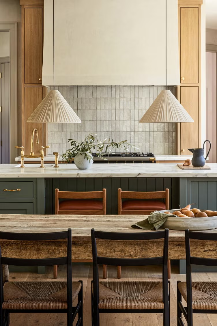
Interior Design: Lauren Nelson; Photography: Seth Smoot; Source: House Beautiful, August 2022
The True Role of Color
Used well, color doesn’t shout—it shapes. It provides dimension. It draws your eye where it needs to go and fades into the background when it should.
A neutral room touched by thoughtful color doesn’t lose its calm. It gains clarity. Presence. Identity.
This is the power of subtle color: not to overwhelm, but to deepen the experience of being in a space.